Redesigning SpareRoom to Make Room Searching Easier and Faster
Redesigning SpareRoom to Make Room Searching Easier and Faster

SpareRoom is a well-known platform in the UK for finding flatmates and rental options, a tool that became invaluable to me as an international student trying to settle into a new city. But while the site has a reputation for its range of listings, navigating through it proved challenging, revealing various user experience issues. Driven to make the site more user-friendly, we decided to conduct a comprehensive study, initially testing both the SpareRoom desktop site and mobile app. After gathering insights from seven participants, I found that 85% preferred the mobile app for its streamlined experience. Recognizing this, I decided to focus on enhancing the SpareRoom website’s usability, aiming to create a more intuitive desktop experience for all users.
SpareRoom is a well-known platform in the UK for finding flatmates and rental options, a tool that became invaluable to me as an international student trying to settle into a new city. But while the site has a reputation for its range of listings, navigating through it proved challenging, revealing various user experience issues. Driven to make the site more user-friendly, we decided to conduct a comprehensive study, initially testing both the SpareRoom desktop site and mobile app. After gathering insights from seven participants, I found that 85% preferred the mobile app for its streamlined experience. Recognizing this, I decided to focus on enhancing the SpareRoom website’s usability, aiming to create a more intuitive desktop experience for all users.
Duration
Duration
2 months
2 months
My role
My role
As the UX designer, researcher, and strategist for this project, I led the end-to-end process from research to testing and iterative design. My responsibilities included identifying pain points, running usability testing, and designing solutions to refine SpareRoom’s user experience.
As the UX designer, researcher, and strategist for this project, I led the end-to-end process from research to testing and iterative design. My responsibilities included identifying pain points, running usability testing, and designing solutions to refine SpareRoom’s user experience.
Context
Context
Moving to a new country comes with enough challenges—finding a place to live shouldn’t be one of them. As an international student using SpareRoom, I quickly realized that many other users likely struggled with the same issues I faced. This prompted me to start this UX project, with a primary goal of streamlining SpareRoom’s core features and making the platform more intuitive and user-friendly.
Moving to a new country comes with enough challenges—finding a place to live shouldn’t be one of them. As an international student using SpareRoom, I quickly realized that many other users likely struggled with the same issues I faced. This prompted me to start this UX project, with a primary goal of streamlining SpareRoom’s core features and making the platform more intuitive and user-friendly.
Problem
Problem
Users faced three main challenges: trouble locating and applying filters, a cluttered layout with excessive white space, and difficulty finding key navigation options. These issues led to longer task completion times, higher error rates, and lower engagement scores.
Users faced three main challenges: trouble locating and applying filters, a cluttered layout with excessive white space, and difficulty finding key navigation options. These issues led to longer task completion times, higher error rates, and lower engagement scores.
Solution
Solution
Users faced three main challenges: trouble locating and applying filters, a cluttered layout with excessive white space, and difficulty finding key navigation options. These issues led to longer task completion times, higher error rates, and lower engagement scores.
Users faced three main challenges: trouble locating and applying filters, a cluttered layout with excessive white space, and difficulty finding key navigation options. These issues led to longer task completion times, higher error rates, and lower engagement scores.
How it all started…
How it all started…
Let's rationalise some of the design decisions together!
Let's rationalise some of the design decisions together!
Diving into Research and User Testing
Diving into Research and User Testing
Research
Research

The journey begins with thorough research to understand what Spareroom users need and how they behave. Rental market was analyzed and competitor platforms were reviewed to see what's working and what's not. User surveys were conducted with over 35 participants, this helped us understand their pain points, preferences, and what they expect from the platform.
1 week
1 week
Testing

Testing
We then conducted usability testing with 7 participants, to uncover specific pain points. Each participant were given specific tasks to complete on the SpareRoom website. We tracked various metrics, including task completion rates, time taken to complete tasks, and the number of errors encountered.
2 weeks
2 weeks
Here’s what the results looked like:
Here’s what the results looked like:
Filter application
Filter application
Task Completion Rate: 45%
Task Completion Rate: 45%
Average Time Taken: 4 minutes 50 seconds
Average Time Taken: 4 minutes 50 seconds
Common Errors: Difficulty locating filters, confusion over multiple options.
Common Errors: Difficulty locating filters, confusion over multiple options.
Page Layout:
Page Layout:
Visual Engagement: Rated 2.5 out of 5
Visual Engagement: Rated 2.5 out of 5
Content Readability: Rated 3 out of 5
Content Readability: Rated 3 out of 5
User Comments: "Too much white space", "Feels cluttered"
User Comments: "Too much white space", "Feels cluttered"
Navigation Visibility:
Navigation Visibility:
Task Completion Rate: 60%
Task Completion Rate: 60%
Average Time Taken: 3 minutes 20 seconds
Average Time Taken: 3 minutes 20 seconds
Common Issues: Important options like rooms, flatmates, and buddyups were hard to spot due to dense text on a background image
Common Issues: Important options like rooms, flatmates, and buddyups were hard to spot due to dense text on a background image
Insights from Users
Insights from Users
Breakdown of the Problems
Breakdown of the Problems
1
1
Difficulty in Locating and Applying Filters
Difficulty in Locating and Applying Filters
🙎🏻♂️ “I was lost in the options; it took ages to find the right filter and even longer to apply it.”
🙎🏻♂️ “I was lost in the options; it took ages to find the right filter and even longer to apply it.”
SpareRoom's filters, while comprehensive, lacked structure, making it hard for users to apply them efficiently. This led to higher task times and increased user frustration, signaling the need for a more intuitive filter design.
SpareRoom's filters, while comprehensive, lacked structure, making it hard for users to apply them efficiently. This led to higher task times and increased user frustration, signaling the need for a more intuitive filter design.
2
2

Inconspicuous Navigation Options
Inconspicuous Navigation Options
🙎🏻♂️“I couldn’t find the main options. They’re buried in text and visuals.”
🙎🏻♂️“I couldn’t find the main options. They’re buried in text and visuals.”
Key sections like rooms, flatmates, and buddyups were hard to locate, especially on the homepage. The navigation elements were hidden within dense text over background images, making essential features less accessible.
Key sections like rooms, flatmates, and buddyups were hard to locate, especially on the homepage. The navigation elements were hidden within dense text over background images, making essential features less accessible.
3
3

Cluttered Layout with Excessive White Space
Cluttered Layout with Excessive White Space
🙎🏻♂️"There’s so much white space, but it still feels cluttered. I have to hunt for information."
🙎🏻♂️"There’s so much white space, but it still feels cluttered. I have to hunt for information."
The layout's excessive white space made the page feel empty yet cluttered. This layout reduced the site’s visual engagement and readability, affecting users' focus on important details.
The layout's excessive white space made the page feel empty yet cluttered. This layout reduced the site’s visual engagement and readability, affecting users' focus on important details.
Typography
Typography
One of the usability issues uncovered during testing was related to the website’s typography. The previous font, Quicksand, although modern and sleek, was often described by users as “too light” and “not prominent enough.
Aa
Aa
Aa
Font Family: Inter
Font Family: Inter
To address this, I replaced Quicksand with Inter, a font designed with a focus on readability and versatility. Inter’s clean, sans-serif design offers excellent legibility, even at smaller sizes, making it well-suited for digital platforms. Its slightly wider letterforms and higher x-height create a strong visual presence, ensuring that users can scan and read information quickly without strain.
Discover
Discover
Discover

The research and usability testing findings were synthesized to pinpoint core issues and improvement opportunities. The problems were clearly defined, solutions were then brainstormed and prioritised, based on their impact and how feasible they are to implement.
The research and usability testing findings were synthesized to pinpoint core issues and improvement opportunities. The problems were clearly defined, solutions were then brainstormed and prioritised, based on their impact and how feasible they are to implement.
The research and usability testing findings were synthesized to pinpoint core issues and improvement opportunities. The problems were clearly defined, solutions were then brainstormed and prioritised, based on their impact and how feasible they are to implement.
2 weeks
2 weeks
Design
Design
Design

The design phase focused on creating solutions to address the identified issues and enhance the overall user experience. Wireframes and prototypes were designed to test potential changes. Based on user feedback, the designs were refined.
The design phase focused on creating solutions to address the identified issues and enhance the overall user experience. Wireframes and prototypes were designed to test potential changes. Based on user feedback, the designs were refined.
The design phase focused on creating solutions to address the identified issues and enhance the overall user experience. Wireframes and prototypes were designed to test potential changes. Based on user feedback, the designs were refined.
3 weeks
3 weeks
Solutions
Solutions
How might we adrress all the problems and make Sparerooms' website more more streamlined, visually engaging and user friendly?
How might we adrress all the problems and make Sparerooms' website more more streamlined, visually engaging and user friendly?
Solution 1
Solution 1
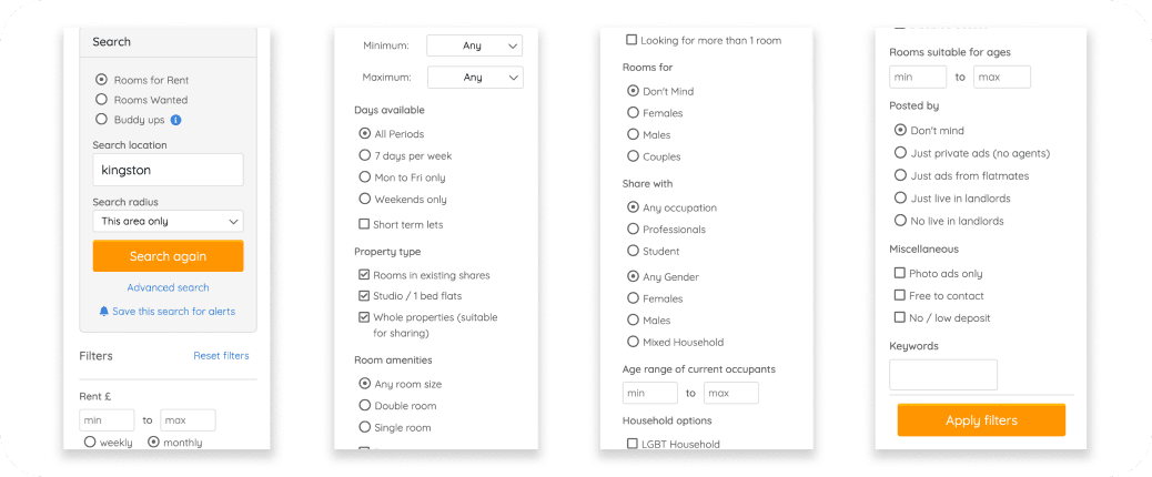
Streamlined Filter Interface
Streamlined Filter Interface
Streamlined Filter Interface
To simplify the filtering experience, I reorganized filter options into clear, intuitive categories (e.g., location, budget, amenities) and added a step-by-step filtering process to guide users through narrowing down results. Visual cues, such as icons and real-time updates, helped users understand the filters at a glance. These adjustments led to a 25% improvement in task completion rates (from 60% to 85%) and reduced the average time to apply filters by nearly half.
To simplify the filtering experience, I reorganized filter options into clear, intuitive categories (e.g., location, budget, amenities) and added a step-by-step filtering process to guide users through narrowing down results. Visual cues, such as icons and real-time updates, helped users understand the filters at a glance. These adjustments led to a 25% improvement in task completion rates (from 60% to 85%) and reduced the average time to apply filters by nearly half.
To simplify the filtering experience, I reorganized filter options into clear, intuitive categories (e.g., location, budget, amenities) and added a step-by-step filtering process to guide users through narrowing down results. Visual cues, such as icons and real-time updates, helped users understand the filters at a glance. These adjustments led to a 25% improvement in task completion rates (from 60% to 85%) and reduced the average time to apply filters by nearly half.
Solution 2
Solution 2
Balanced Layout with Reduced Clutter
Balanced Layout with Reduced Clutter
For the layout, I minimized excessive white space and implemented a consistent spacing guide to create a more balanced look. Important information was highlighted with bold fonts and contrasting colors to guide users’ attention. I added images and interactive elements to break up text and make the page visually appealing. After these changes, user ratings for visual engagement rose from 2.5 to 4 out of 5, while readability improved from 3 to 4.5 out of 5.
For the layout, I minimized excessive white space and implemented a consistent spacing guide to create a more balanced look. Important information was highlighted with bold fonts and contrasting colors to guide users’ attention. I added images and interactive elements to break up text and make the page visually appealing. After these changes, user ratings for visual engagement rose from 2.5 to 4 out of 5, while readability improved from 3 to 4.5 out of 5.
For the layout, I minimized excessive white space and implemented a consistent spacing guide to create a more balanced look. Important information was highlighted with bold fonts and contrasting colors to guide users’ attention. I added images and interactive elements to break up text and make the page visually appealing. After these changes, user ratings for visual engagement rose from 2.5 to 4 out of 5, while readability improved from 3 to 4.5 out of 5.
Solution 3
Solution 3
Enhanced Navigation Visibility
Enhanced Navigation Visibility
Enhanced Navigation Visibility
To make navigation more accessible, I positioned the main sections (rooms, flatmates, buddyups) prominently at the top with distinct buttons and icons. I reduced the text overlay on background images to prevent visual clutter and ensured high contrast between navigation text and images. This resulted in a 35% increase in navigation task completion rates (from 40% to 75%) and reduced average completion time to 2 minutes 30 seconds.
To make navigation more accessible, I positioned the main sections (rooms, flatmates, buddyups) prominently at the top with distinct buttons and icons. I reduced the text overlay on background images to prevent visual clutter and ensured high contrast between navigation text and images. This resulted in a 35% increase in navigation task completion rates (from 40% to 75%) and reduced average completion time to 2 minutes 30 seconds.
To make navigation more accessible, I positioned the main sections (rooms, flatmates, buddyups) prominently at the top with distinct buttons and icons. I reduced the text overlay on background images to prevent visual clutter and ensured high contrast between navigation text and images. This resulted in a 35% increase in navigation task completion rates (from 40% to 75%) and reduced average completion time to 2 minutes 30 seconds.
Testing
Testing
Testing
After implementing the initial solutions, I conducted further testing to gauge effectiveness. Feedback from this second round informed minor tweaks, such as adjusting font sizes and adding more visual cues for navigation. By testing and iterating, I refined the design to ensure it fully addressed user needs, resulting in a final, polished interface.
After implementing the initial solutions, I conducted further testing to gauge effectiveness. Feedback from this second round informed minor tweaks, such as adjusting font sizes and adding more visual cues for navigation. By testing and iterating, I refined the design to ensure it fully addressed user needs, resulting in a final, polished interface.
After implementing the initial solutions, I conducted further testing to gauge effectiveness. Feedback from this second round informed minor tweaks, such as adjusting font sizes and adding more visual cues for navigation. By testing and iterating, I refined the design to ensure it fully addressed user needs, resulting in a final, polished interface.
Measuring Success
Measuring Success
Filter Application
Task completion rate improved to 85%, with average time reduced to 2 minutes.
Layout Engagement
Visual engagement rose from 2.5 to 4 out of 5, and readability from 3 to 4.5 out of 5.
Navigation
Task completion rate increased to 75%, with average navigation time reduced to 2 minutes 30 seconds.
Next Steps
Next Steps
If given more time, I would explore adding personalized filter suggestions, optimizing the mobile experience further, and integrating user feedback tools to maintain ongoing improvements. These next steps could further tailor the SpareRoom experience to diverse user needs, ensuring it remains a reliable and intuitive platform for accommodation seekers.
If given more time, I would explore adding personalized filter suggestions, optimizing the mobile experience further, and integrating user feedback tools to maintain ongoing improvements. These next steps could further tailor the SpareRoom experience to diverse user needs, ensuring it remains a reliable and intuitive platform for accommodation seekers.
If given more time, I would explore adding personalized filter suggestions, optimizing the mobile experience further, and integrating user feedback tools to maintain ongoing improvements. These next steps could further tailor the SpareRoom experience to diverse user needs, ensuring it remains a reliable and intuitive platform for accommodation seekers.
View Resume
View Resume
Thank you
Thank you
Thank you